POLICYGENIUS
2020
A fine studio, llc
Policygenius wanted a rebrand their internal team can easily implement, and is externally easily recognized. My task was to give the brand a scalable visual device that non-brand designers could easily replicate both in physical and digital spaces. It needed to feel modern and approachable to stand out from the coldness and corporate feeling of the insurance and fintech industries. With their growth, Policygenius’ audience shifted toward a more premium audience that still needed to speak to the masses. My solution was to strip back the brand to its logo and build an incremental design system that ladders up to the brand strategy: “it’s nice to get it right.”
Role:
Brand Strategy, Design, UX Design, Product Design, Design Direction, Design Ops

The biggest problem was a watered down implementation of the previous brand — giving an unclear visual and tonal brand perspective. By restructuring the way the business thinks about its output, and bottle-necking approvals to a group of brand ambassadors, the quality and consistency of the brand improves.


The “Genius” icon was never meant to be used as an iconmark, but because of social media, and other spaces necessitating a simplified mark, the icon became an iconmark. With this brand evolution, there’s a nod to the Genius, but it has otherwise been phased out.


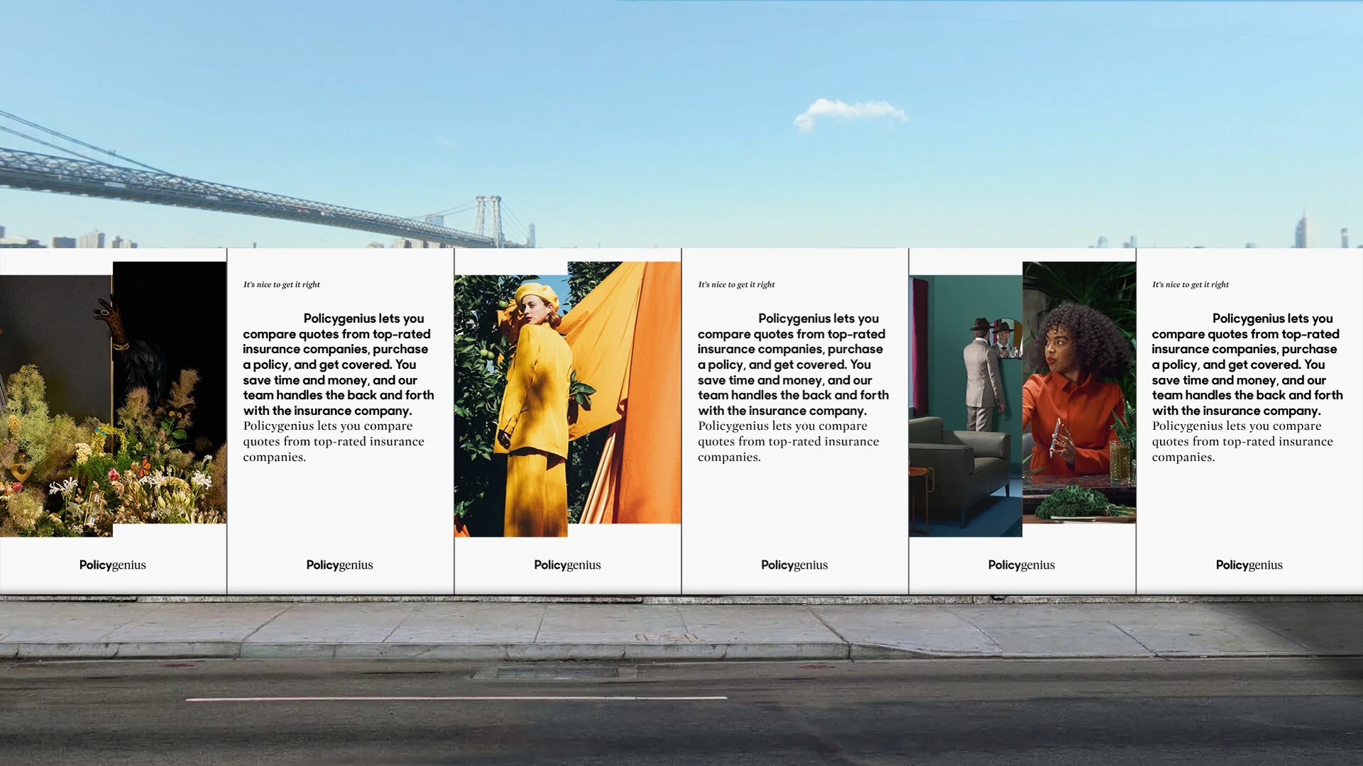
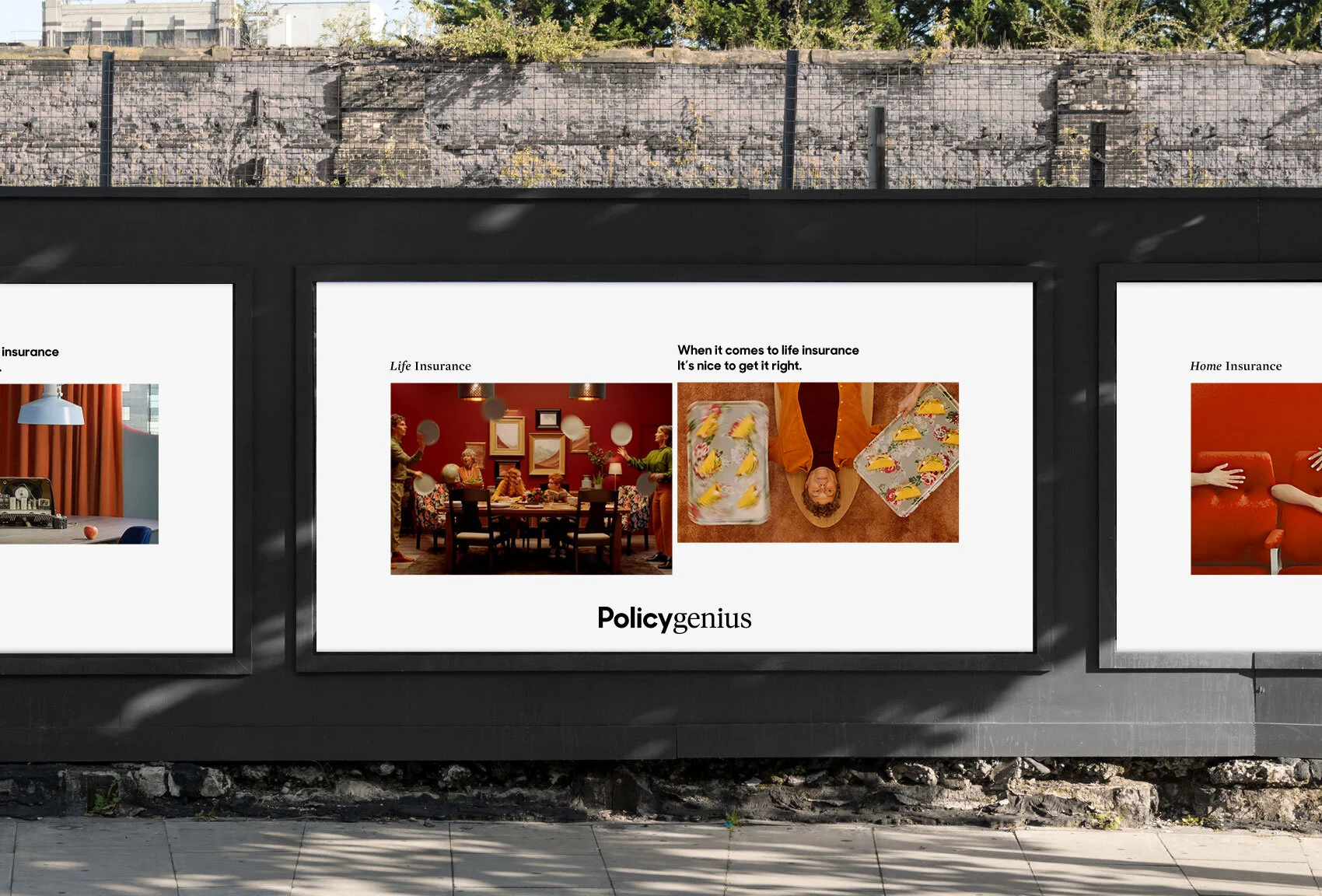
NOTE: All photography is FPO, but stylistically accurate until Policygenius has a photoshoot later this year.
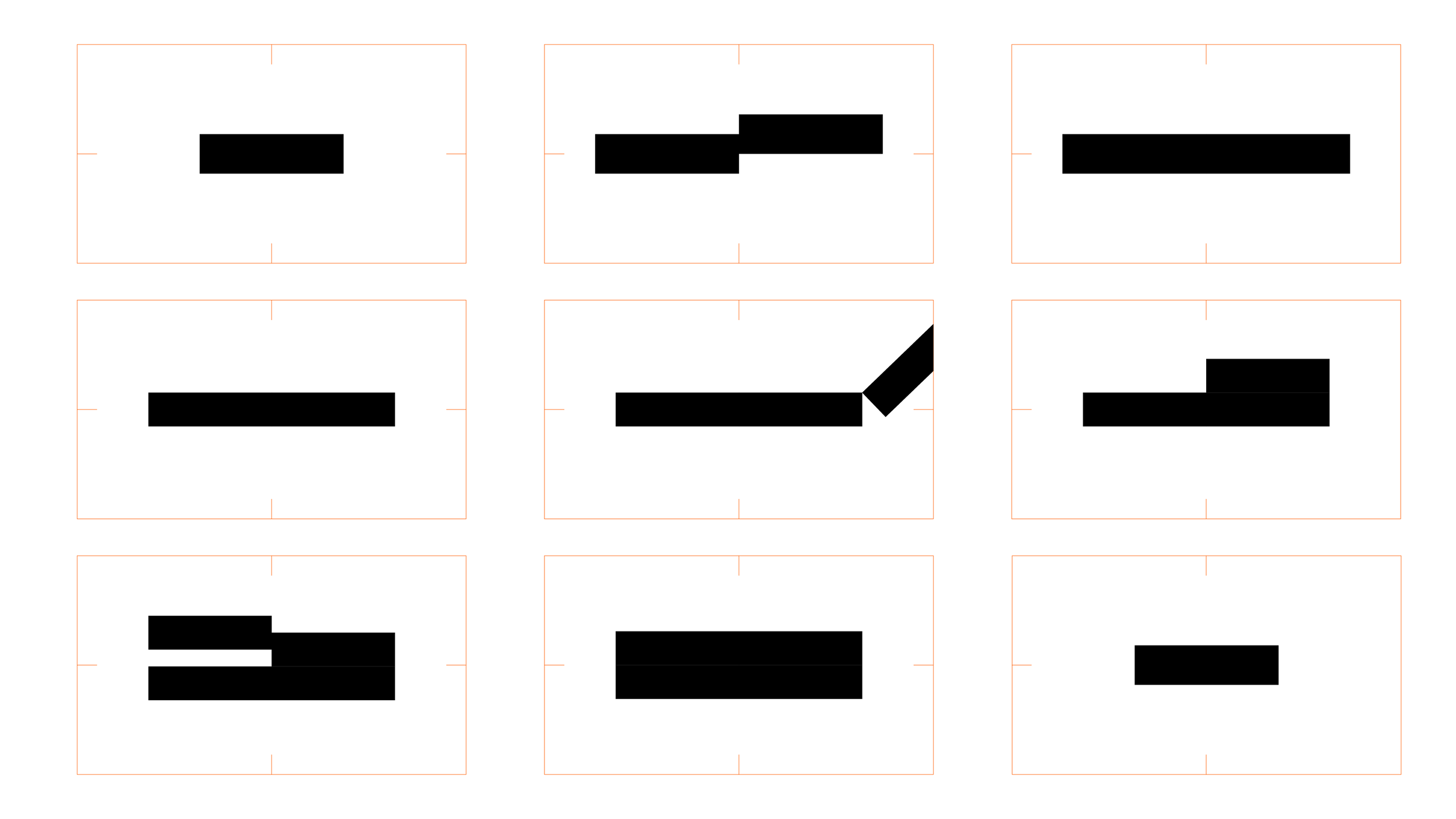
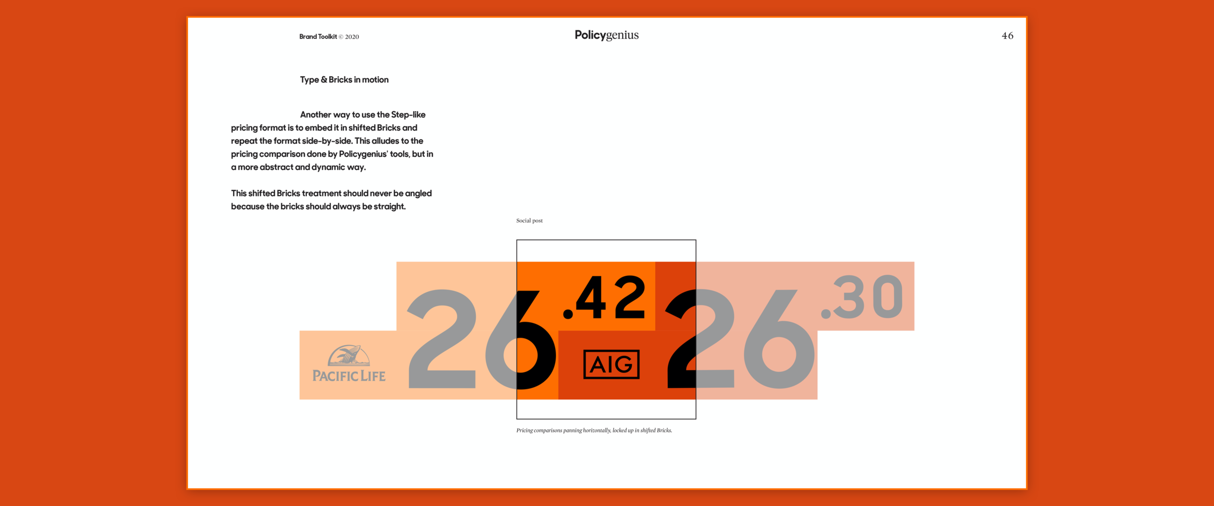
The Brick when halved or quatered perfectly measures the original Brick size when multiplied proportionally. In other words, the shape creates fractals that can create unique and ownable layouts, or in this case an endless looping gif where the Step rebuilds the original Brick.

Full guidelines were created to breakdown the design system, its implementation, and possibilities for scaling the brand as needed.


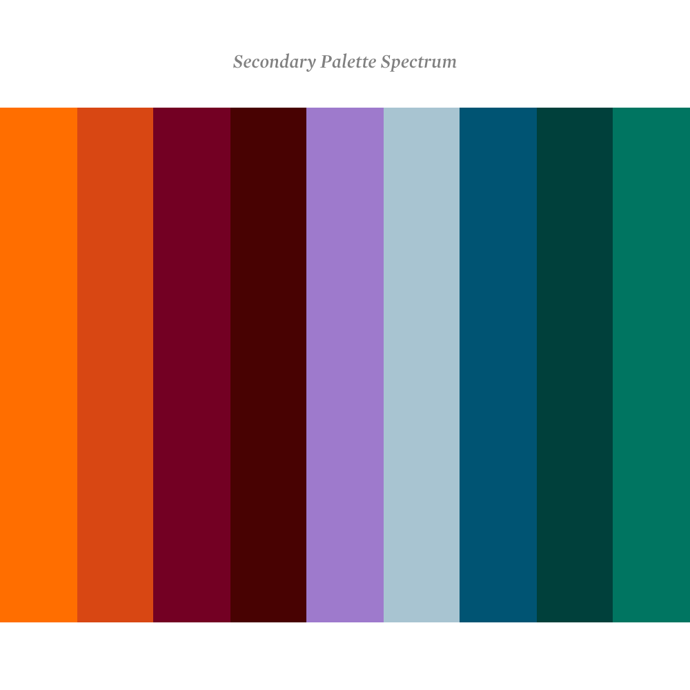
The full palette spectrum for flexibility in photography, illustration and motion.

patterns
The Brick and the metaphor of the Step lend themselves to endless, interesting patterning that addresses the boldness Policygenius aspires to, as well as acts as an additional visual aid where illustration and photography aren’t applicable. These patterns can be easily modified for infographics as well.


illustrations
The illustration style was already determined before I joined. I needed to find a system that incorporated the chosen style while still meeting the objectives of the rebrand: premium, approachable, and implementable. To achieve this, the colors used in the illustrations needed to be incorporated in the Policygenius color ecosystem, and the usage of these illustrations specified. Because of the anticipated growth of the company, the illustrations were housed within a perspective, rather than limited to a specific style.


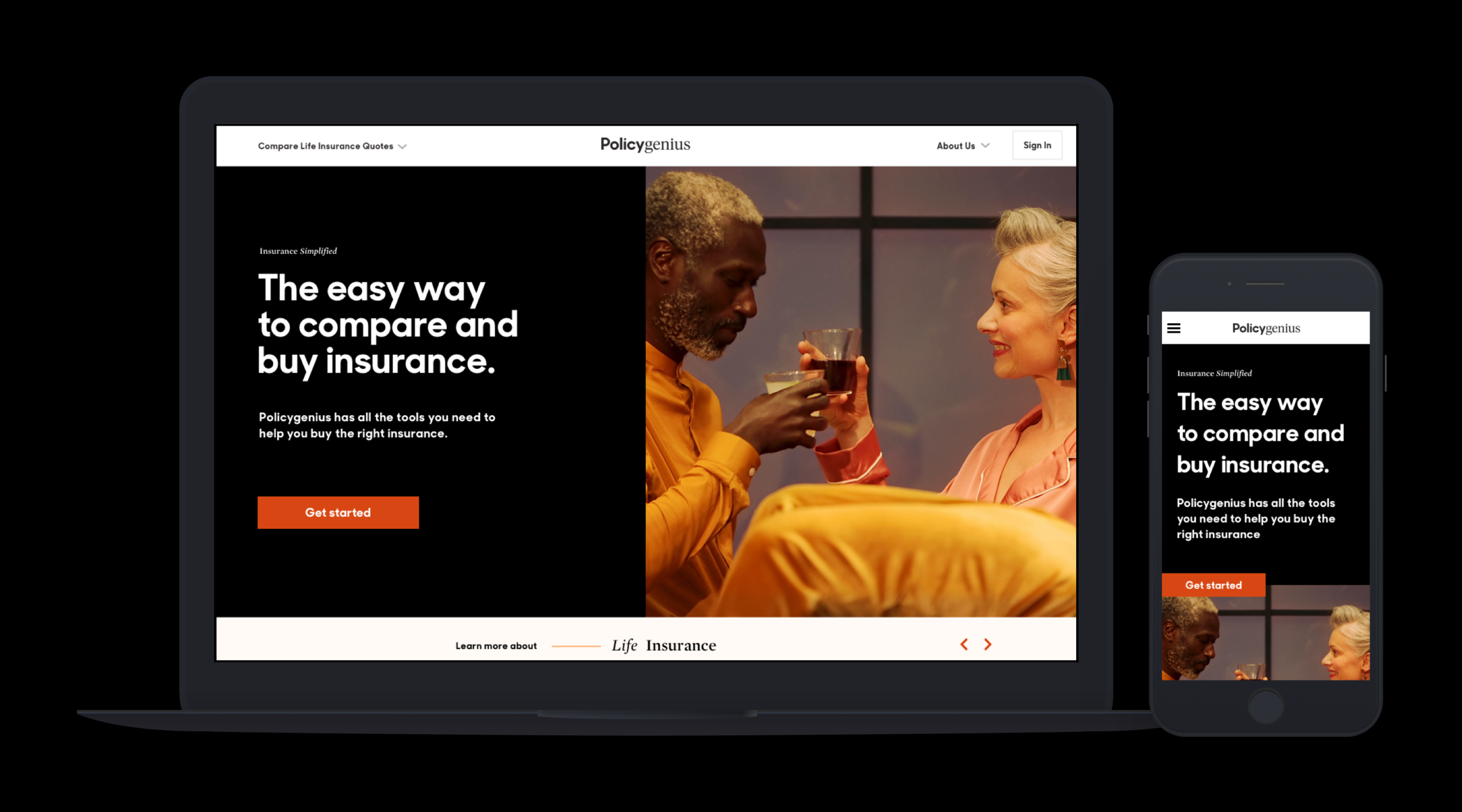
The varying typefaces create a premium-feeling texture on the page that differentiates itself from other FinTech brands. It's also an opportunity to play and have fun with the messaging. It's meant to feel dynamic, optimistic, and editorial.


Because the website is the most important part of the brand experience, I designed the modules to not only be responsive, but maintain the principles of the Step. The modules themselves are delineated by the centralized logo on the website, mimicking the layout principle of the Step as well. A flex of subtle and overt brand devices affords drama and utility where needed throughout the site.