Juice
Pulled from launch august 2017
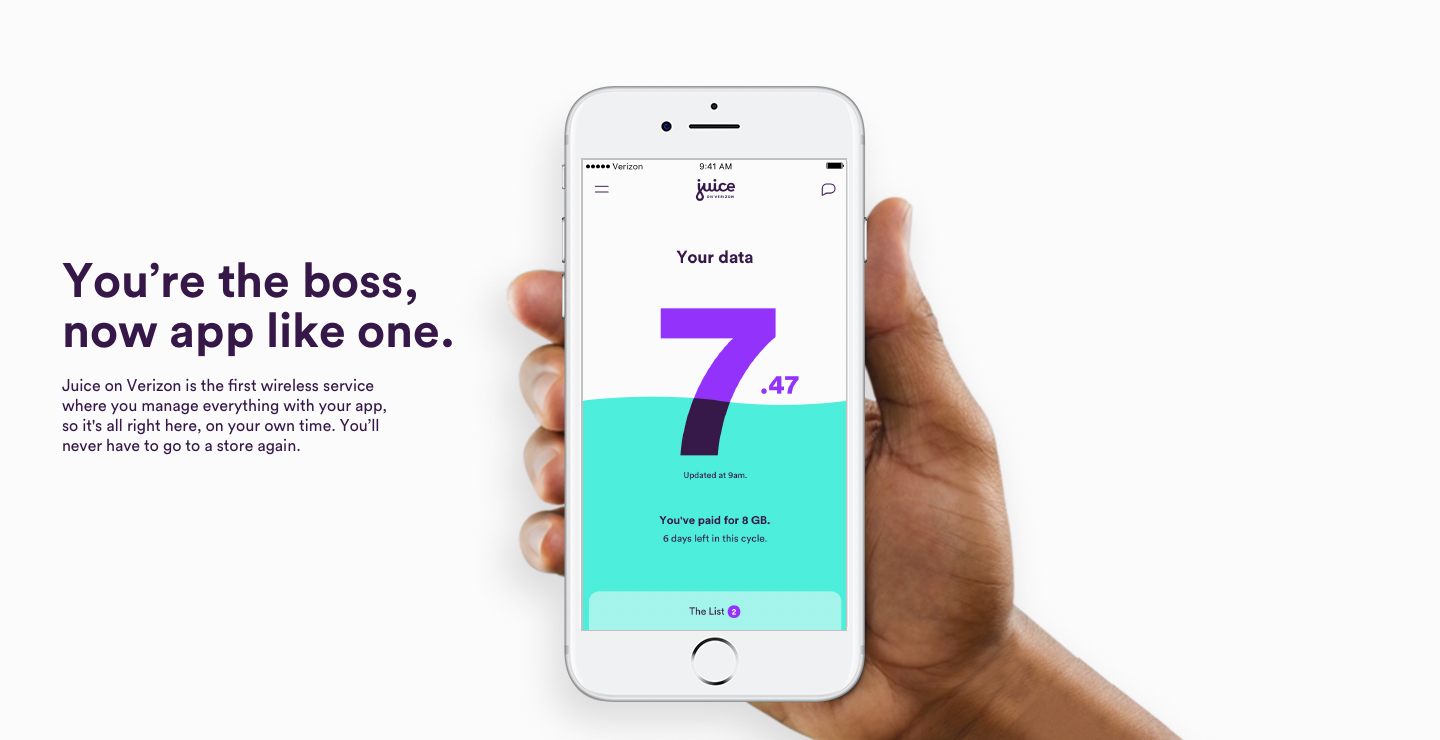
Juice on Verizon is the first mobile service that lets you control what you pay based on the data you use from your phone. Instead of the plans telecom companies have traditionally used, Juice allows you to pay as you go. Everything is controlled from the app. There is no brick and mortar for this product, so everything had to be designed as self-sustaining and easily navigable. The service also required it to be a completely accessible experience end-to-end.
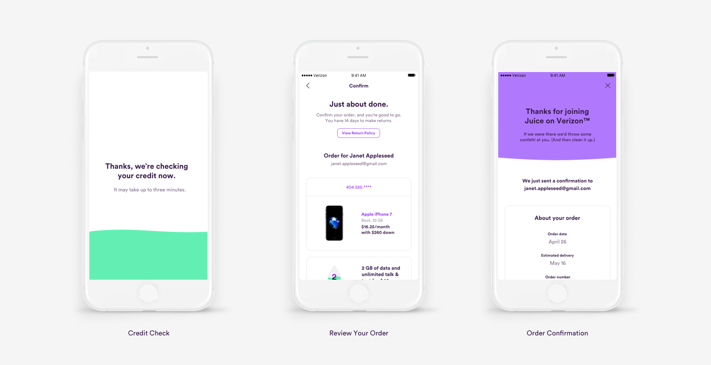
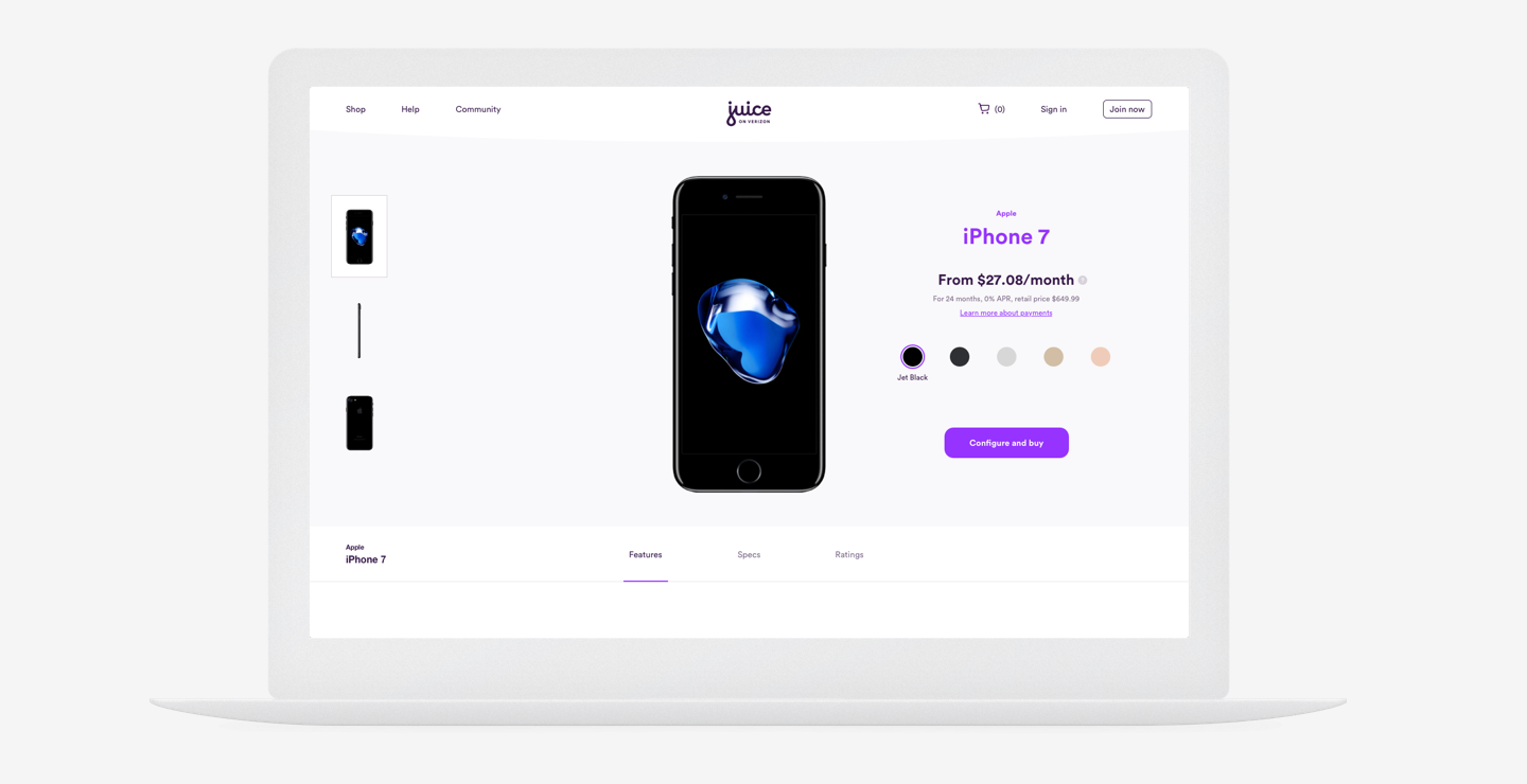
Web and app had their respective roles: app was the core experience where the user could control everything from payment to redeeming rewards; web had minimal functionality so as to encourage the user to download the app, but it nonetheless made all important information accessible, and was predominantly an ecommerce experience to encourage new users to buy / upgrade their phones. This translated visually to a vibrant, playful app, and a fluid, utilitarian web experience.
programs
Sketch (Plug-ins like Brand AI) + Zeplin + Principle + InVision + Photoshop + Illustrator + JIRA

Place your cursor to the left or right of the images to navigate the carousel.
IMPORTANT: This video is set to "Private;" to see the app demo, the password is "heyo".
This is a demonstration of the homepage parallax animations – not final.
Design Director
R/GA
The project was so large it was divided into five core teams. Internally, we had 65 people working across these teams. Including Verizon, and our partners such as GfK and Moxie, we had over 500 people working simultaneously. We also had over 500 client-side stakeholders weighing in daily. Throughout the process we had numerous user testings – after 6 months, over 100 tests had been completed and over 10k questions asked. These findings informed our design decisions in real-time.
I oversaw Team 2 which was responsible for the entire ecommerce experience in both responsive web (desktop and mobile) and in app. We had 3 full-time designers including myself, and 4 UX designers. I oversaw our team's work as well as other teams' to ensure consistency in branding and user experience.
The process was run agile. Tech, branding, and design were simultaneously developed. By staggering the responsibilities, we were able to complete work in 4 week iterations. This also meant that design and UX worked side-by-side to inform the decisions, building off of one another's thinking. We also provided full annotations to tech at the end of each iteration.
The ecommerce experience was broken down into upper, middle and lower funnels. We delivered screens for over 30 features for prospect and existing customers (happy path, unhappy path, error states, and edge cases included). By the end of fourth iteration, we delivered almost 2000 screens, fully annotated, for responsive web and app – our team was the most prolific. Four months into the project, the team at large dispersed and I was asked to stay on with a few others as part of the transition team. In that time I oversaw Team 2 and 3's work. I not only fixed designs based on new learnings, but also QA'd what was being built for launch, and trained client-side designers for maintenance and growth after launch.


IMPORTANT: This video is set to "Private;" to see the app demo, the password is "heyo".
This is a demonstration of the offers results page animation.


The juice on the HUD moves and undulates based on how the user holds the phone. All other elements remain upright.

IMPORTANT: This video is set to "Private;" to see the app demo, the password is "heyo".
This is a demonstration of the app's features.